
When creating software, you’re often forced to choose between making existing functionality better or adding more functionality. A related dilemma is between making it what I call broader versus deeper, where breadth is the amount of user interface “stuff” (dialogs, controls, windows, etc) and depth is the value of each element. The most obvious way to add functionality is by adding UI stuff, but as Alan Cooper pointed out “No matter how beautiful, no matter how cool your interface, it would be better if there were less of it”.
Here are some characteristics of depth versus breadth:
Depth is often discovered by guessing, reading, or just using without thinking. It’s easy to look at the Microsoft Calculator and know what it can do but you need to stumble upon the Google calculator to know it even exists. Do you use the Google toolbar? If so, do you know that you can press Alt+Enter to do an “I Feel Lucky” search? I bet not since there doesn’t seem to be any UI stuff about this at all.
Making it faster is adding depth. If you make it fast enough that it appears instantaneous you can remove UI stuff such as progress bars or “please wait” messages. Speed has the typical characteristic of depth that it’s hard to do and requires a high threshold of brain power.
Depth is hard. In meetings, breadth is characterized by comments such as “it could do this too” or “some customer requested this option also”. Depth is characterized by someone saying “but is that possible?” It’s more straightforward to add breadth to an existing deep product than depth to an existing broad product since you’re always running out of room as the UI elements fill up the space available.
Adding subtle behavior is adding depth. Overlays, modeless feedback, or auto-completion algorithms are deep. They won’t show up on a feature comparison chart on the back of a box and will largely go unnoticed by the user. Depth is hard to describe and market since you can’t see it; you experience it, or more often the lack of it.
Insufficient depth causes many forms of frustration. Insufficient depth costs users time whereas adding depth costs developers time. Lack of depth causes many different forms of frustration: slow, buggy, intolerant of user errors, difficult to use. Lack of functionality causes only one form of frustration: “it doesn’t do what I need!”
Breadth is good when going after vertical markets. Specific markets have specific needs and care more about meeting those needs than meeting them in the most optimal (expensive) way possible. Depth is good for universal problems. Businesses lean towards breadth because it’s easier to calculate how it affects their potential market and requires less thinking. Depth leads to fandom. Breadth can lead to lock-in if you cover enough area at once.
Another Example
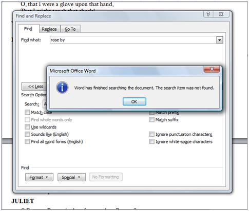
Here’s some of the UI for finding text in Microsoft Word 2007:

It’s wide and it also has some deep features such as “Find all word forms” and “Sounds like”. I don’t use any of these and you don’t either but it doesn’t bother me that they’re there. Microsoft obviously spent an enormous amount of money developing this and presumably some of their customers find these options useful.
But having this dialog doesn’t substitute for a quick way to jump to some text with minimal effort. Something like that would have the deep features of providing early-as-possible feedback, clear-as-possible results, and minimal user input. HandyFind is my attempt to do just that. It has virtually no UI stuff but it has deep features such as animation, interactivity, and multiple application support.
Conclusion
As a user and a sympathetic software developer I lean towards depth even if it means accepting that a particular version of software can’t do everything I want.